Over our years of writing weekly Q&A articles we have highlighted Garrett Snuff, National Vulcanized Fiber, Spatz Fiberglas dune buggies, and Spitz planetariums. One of several threads common to these Yorklyn corporations is they became world-known for their industry-leading products. Each company served as a bellwether within their business segment. There is another company calling Yorklyn its home, that while small in footprint perhaps, this company enjoys a global reach to the point of their product being consumed by perhaps more of the world’s population than the rest of Yorklyn’s past businesses combined. What does this company produce?
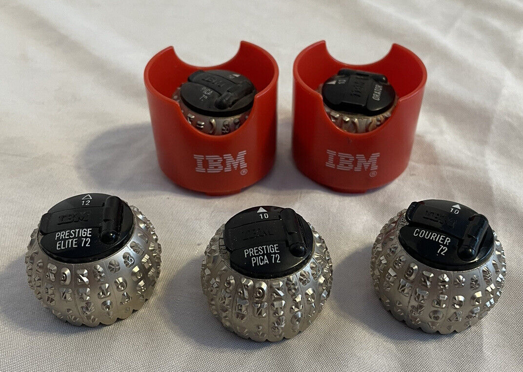
Perhaps the image below will provide a clue!
Answer
 When we look at the 250-plus year history of the Auburn-Yorklyn Valley, we find paper made by Horatio Gates Garrett at the start of the 1800s. At the end of the 1890s, paper manufacture returned to Yorklyn with the Marshall family, where a specialty rag paper was converted to vulcanized fibre, making fiber the first manmade plastic and world’s first manmade laminated product. Today House Industries carries on the tradition as a premier producer of digital typefaces and fonts that find a use on paper packaging and on all forms of printed matter. House typefaces appear on movie screens, televisions, and computer and mobile device displays the world over.
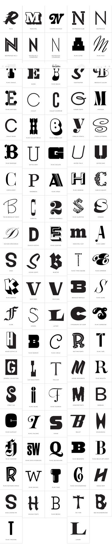
Known throughout the world as a premier type foundry, this Yorklyn business has made a considerable impact on typeface and font design. Their fonts scream from billboards and websites, wish happy whatever from greeting cards, serve as the basis for consumer product logos. The company’s typefaces and added graphic elements of style, adorn a wide range of mainstream media applications. What ultimately shines in the House Industries oeuvre is what always conquers mediocrity: a genuine love for their subject matter – letters, numerals, glyphs, and ligatures.
House Industries’ artists have mastered a large cross-section of design disciplines to produce a product inspiring the subconscious while exciting our emotions. Their typography deftly melds cultural, musical, and graphic elements. Their product transcends graphic conventions and reaches out to broad audiences. This description, adopted from the FontStand.com page devoted to House Industries of Yorklyn, DE, deftly defines the company.
Founded in 1993 by Andy Cruz and Richard Roat, House Industries is a digital typeface foundry. Long gone are the days of foundries casting metal letters and distributing those letter sets for use in hand typesetting. With the advent of the computer age came the need to create digital typefaces. The first computer fonts, called bitmap or raster fonts, were letters composed of square boxes arranged to look like a specific letter.
In 1968 the first digital font was created – DigiGrotesk. By 1970 the first Optical Character Recognition (OCR) font was developed, which allowed computers to “read” printed pages characters on objects like checks. Adobe, formed in 1982, developed the PostScript typography based on mathematical constructs that describe an alphanumeric character.
Next developed was TrueType fonts, which reduced the mathematical constructs to tabular form. With the increased power of computing processors artists, industrial designers, and others began the development of the vast number of font libraries we see today. House Industries took typefaces to a whole new level by making each letter and numeral its own distinctive artworks as a collection of characters fits together into words. Those words form phrases and sentences conveying vision, inspiration, emotion, curiosity, intrigue, and so much more than had the author or graphic designer simply selected Arial, Times New Roman, or Helvetica font families.
One of House Industries’ earliest clients was Warner Brothers Records. The company’s Neutraface soon became a widely recognized and used typeface. If you have ever seen a Shake Shack you have looked upon Neutraface! House’s various typefaces appear in many of J.J Abrams movies, The New Yorker magazine, Target, and on the Jimmy Kimmel show. In 2017 the Henry Ford Museum highlighted House Industries’ creative process from inspiration to reality in a custom exhibit titled A Type of Learning. Delawareans drive past House Industries’ light green building not knowing that movie titles, magazine covers and billboards, video games, album covers, and mind-boggling numbers of product packages and advertising, rely on the creative and award-winning typefaces designed at House Industries where their motto is “The Process Is the Inspiration.”
Watch this segment from “The Henry Ford’s Innovation Nation” to see more examples of House Industries’ craftsmanship: https://www.youtube.com/watch?v=Odp-d_TyHug